Decluttering Amazon's Offers for Products below 1500 Rs for Non-Prime users
Improving Conversion by Prioritizing Contextually Relevant Discounts and promoting own products
Product Overview
Amazon.in is India's largest e-commerce platform, catering to a highly price-sensitive market where "Offers" (Bank Discounts, Cashback, No Cost EMI) are primary drivers of purchase decisions. The Product Detail Page (PDP) is the critical "moment of truth" where a user evaluates value.
Currently, the "Bank & Partner Offers" section aggregates all potential promotions associated with a category. While this maximizes the number of offers shown, it often fails to filter for Cashback relative to the specific item in the cart or the user's eligibility.
This case study analyzes how the current logic displaying high-value but ineligible offers first creates cognitive friction and proposes a context-aware sorting mechanism to improve trust and speed-to-checkout.
The Problem
The "Cashback" section creates false hope by surfacing high-value coupons that are mathematically impossible to redeem for the current product.
In the scenario analyzed (referencing attached screenshots):
- The user is viewing a product priced at ₹899.
- The UI promises "2 Cashback Offers".
- Offer 1 (Shown Top): "Get ₹399 Cashback" Requires minimum order of ₹1,500 + Prime. (Irrelevant).
- Offer 2 (Buried): "Get ₹10 Cashback" Requires minimum order of ₹500. (Relevant).
The system prioritizes the "Big Number" (₹399) over the "Applicable Number" (₹10), forcing the user to read fine print, do mental math, and eventually feel disappointed.
Visual Evidence Analysis
Top Offer: ₹399 Cashback
Constraint 1: Prime Only
Constraint 2: Min Order ₹1500
Result: User feels tricked.
Bottom Offer: ₹10 Cashback
Constraint: Amazon Pay (Valid)
Result: User misses guaranteed savings.
Why This Matters
- Cognitive Load: Users visited a second page just to do a math : "If Price (899) < Threshold (1500) & Not a Prime Member, then Offer is Null." This should be system-handled.
- Banner Blindness: When users repeatedly click "Cashback Offers" only to find they don't qualify, they stop checking the section entirely, missing out on genuine savings (like the ₹10 offer with AmazonPay).
- Trust Erosion: Showing a "₹399 Cashback" banner on an ₹899 item feels deceptive, even if the T&C explains the mismatch.
- Conversion Friction: The disappointment of "losing" a discount pauses the checkout flow. The user might leave to find a cheaper product to meet the threshold or abandon the cart.
- Missed Upsell Opportunity: The current UI says "Min order ₹1500" as a restriction. It should frame it as an opportunity: "Add ₹601 more to unlock ₹399 cashback."
Current vs. Ideal State
Current State: Offers are likely sorted by Offer Value (High to Low). An invalid ₹399 offer ranks higher than a valid ₹10 offer.
Ideal State: Offers are sorted by Applicability. Valid offers appear first. Invalid offers appear second, clearly marked as "Upsell Opportunities."
Root Cause Analysis
The sorting logic likely stems from these technical/business factors:
- Category-Level Fetching: The API retrieves offers linked to "Electronics > Headphones" without cross-referencing the specific SKU price (₹899) in real-time.
- Marketing Bias: There is a legacy assumption that showing larger numbers (₹399) leads to higher CTR than small numbers (₹10), ignoring the post-click disappointment.
- Static Ranking: The ranking algorithm does not ingest User Context (Prime vs. Non-Prime) or Cart Context (Current Item Price) effectively.
User Personas & Pain Points
| Persona | Priya (The Deal Hunter) | Rahul (The Quick Shopper) |
|---|---|---|
| Behavior | Calculates every rupee. Will switch payment methods for ₹50 savings. | Wants to buy in 3 clicks. Does not read T&C. |
| Pain Point | "I wasted 2 minutes reading an offer for Prime members only to realize I can't use it. Why show it to me?" | "Just tell me the final price. Don't make me click a menu to find out there's no discount." |
| Goal | Maximize savings transparency. | Speed and clarity. |
User Journey: The "Double Lock" Friction
Let's analyze the journey of buying the Wireless Earbuds (₹899) referenced in the screenshots.
The Offer Discovery Roadblock
1. User lands on product page: Wireless Earbuds @ ₹899
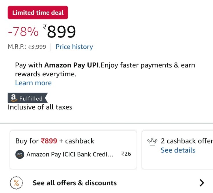
Fig 1: Current Experience. The irrelevant ₹399 offer dominates the view despite being locked behind Prime and a price threshold.
2. Sees badge: "2 Cashback Offers". They think, "Great, extra savings!"
3. Clicks to open the details sheet. Top result: "Get ₹399 Cashback"
4. User reads the first condition: "Prime Only"
5. User reads the second condition: "Minimum order: ₹1500"
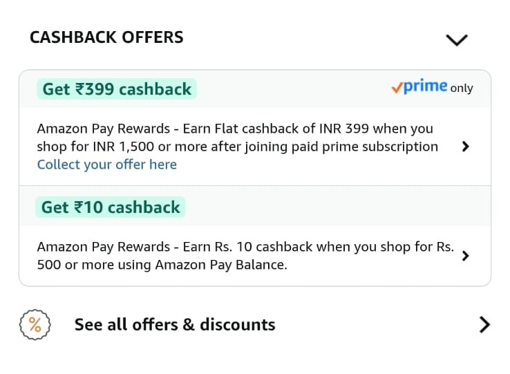
Fig 1: Current Experience. The irrelevant ₹399 offer dominates the view despite being locked behind Prime and a price threshold.
Disappointment: The user feels the "2 offers" badge was misleading.
Missed Value: The actually valid offer (₹10 Cashback) is at the bottom. It is often ignored due to the disappointment of the first one.
Decision Fatigue: The user wonders if they should join Prime or add more items. This confusion often leads to cart abandonment.
Pain Points Analysis
| Pain Point | Impact | Frequency | Why It Happens |
|---|---|---|---|
| Irrelevant offers shown first | High cognitive load, wasted time, false expectations | Every product page visit (estimated 70-80% of offers shown are not applicable) | Offers sorted by value, not applicability. No filtering by product price or user eligibility. |
| Misleading offer count | Creates expectation of savings that don't exist | Every product with offers badge | Counter includes all offers in database, not just applicable ones for this product/user. |
| Membership-locked offers without context | Non-Prime users feel excluded or pressured | 40-50% of offers require Prime | System doesn't pre-filter based on user's Prime status or show clear upgrade path. |
| Complex eligibility criteria buried in fine print | Users miss important conditions, leads to checkout surprises | Almost all offers have conditions | Legal/compliance requirement to show full terms, but no smart summarization. |
| Actually applicable offers hidden below irrelevant ones | Users miss real savings opportunities | Common when multiple offers exist | Sorting algorithm prioritizes offer value over user relevance. |
User Expectations
Relevance First: "Only show me offers that actually apply to this specific product and my account."
Instant Clarity: "Don't make me read 3 paragraphs to figure out if I qualify. Show applicable amount upfront."
Honest Count: "If you say '2 offers', both should be usable. Not 1 real + 1 impossible."
Prioritization Framework (RICE)
| Solution | Reach | Impact | Confidence | Effort | RICE Score |
|---|---|---|---|---|---|
| Smart Filtering: Show Only Applicable Offers | 10/10 | 9/10 | 9/10 | 5/10 | 162 |
| Reorder: Applicable Offers First | 10/10 | 7/10 | 9/10 | 2/10 | 315 |
| Add "Applies to this product" badge | 10/10 | 6/10 | 8/10 | 1/10 | 480 |
| Fix offer count to show only applicable | 10/10 | 8/10 | 9/10 | 3/10 | 240 |
RICE Scoring Explanation
Smart Filtering: Show Only Applicable Offers (Score: 162)
- Reach (10/10): Affects every user viewing product pages with offers. Amazon has millions of daily product page views.
- Impact (9/10): Dramatically reduces user frustration, improves trust, increases conversion by removing friction. Directly addresses root cause.
- Confidence (9/10): High confidence this will work. Industry standard (Flipkart, Myntra already do this). User research strongly supports it.
- Effort (5/10): Moderate engineering effort. Requires building filtering logic based on product price, user Prime status, payment method, and minimum purchase thresholds. Backend changes to offers engine needed.
Reorder: Applicable Offers First (Score: 315)
- Reach (10/10): Universal impact across all product pages.
- Impact (7/10): Helps users find relevant offers faster but doesn't remove irrelevant ones completely. Partial solution.
- Confidence (9/10): Simple logic change, low risk.
- Effort (2/10): Low effort. Just changing sorting algorithm from "offer value" to "applicability score". Can be done in 1-2 sprints.
Add "Applies to this product" Badge (Score: 480)
- Reach (10/10): Every user sees badges on offers.
- Impact (6/10): Improves clarity but users still need to see and process irrelevant offers. Better than nothing.
- Confidence (8/10): Visual indicators work, but doesn't solve root problem of showing irrelevant content.
- Effort (1/10): Very low effort. Frontend-only change to add badge based on existing filtering logic.
Fix Offer Count (Score: 240)
- Reach (10/10): Affects everyone who looks at offer count before clicking.
- Impact (8/10): Removes false expectations. Sets honest expectation of what user will find.
- Confidence (9/10): Straightforward logic change with clear benefit.
- Effort (3/10): Low-moderate effort. Change counter logic to filter by applicability before counting.
Recommended Approach: Implement all four solutions in phases. Start with "Reorder" (quick win, high RICE), then "Add Badge" (also quick), then "Fix Count", and finally "Smart Filtering" (most impactful but needs more dev time). This phased approach delivers continuous improvements while building toward the ideal state.
Why Contextual Sorting Wins?
- Low Effort: It doesn't require redesigning the page widgets (Solution 3) or changing complex business logic to "hide" offers which might be an upsell opportunity (Solution 2).
- High Impact: It solves the immediate frustration by ensuring the first thing the user sees is something they can actually use.
- Upsell Preservation: By moving the ₹1500 offer to the bottom (instead of hiding it), we still allow the "Add more to cart to unlock" behavior, but we don't block the primary purchase flow.
Proposed Solution: The Smart and Honest Selling
We move from a static list to a State-Based Logic Engine. The UI changes dynamically based on who the user is (Prime Status) and what they are buying (Cart Value).
1. The "Hero" Slot: Elevating the ₹10 Offer
Rule: Always show "Applicable" offers at the absolute top.
The ₹10 Amazon Pay offer is small, but it is guaranteed. It acts as a "Quick Win" to validate the user's purchase intent.
- Visual Change: Bring this card to absolute top in the offer section over the Product Detail page
- Messaging: "Save ₹10 instantly with Amazon Pay." (Instead of generic legal text).
Currently, the API likely returns a list of offers linked to the Category. We need to inject Product Price and User Context into the ranking logic.
                        Pseudocode Logic:

                        For each Offer in OfferList:

                          If (Product.Price >= Offer.MinSpend) AND (User.HasMembership == Offer.ReqMembership) AND (User.IsFIrstOrder):

                            Offer.Status = "APPLICABLE"

                            Offer.Rank = 1

                          Else If (Product.Price < Offer.MinSpend):

                            Offer.Status = "UPSELL_OPPORTUNITY"

                            Offer.Rank = 2

                          Else:

                            Offer.Status = "NOT_APPLICABLE"

                            Offer.Rank = 3


                        Sort List by Offer.Rank ASC
2. The UI Change (Frontend)
Redesign the Offer List Sheet to clearly distinguish between "Ready to Use" and "Needs Action".
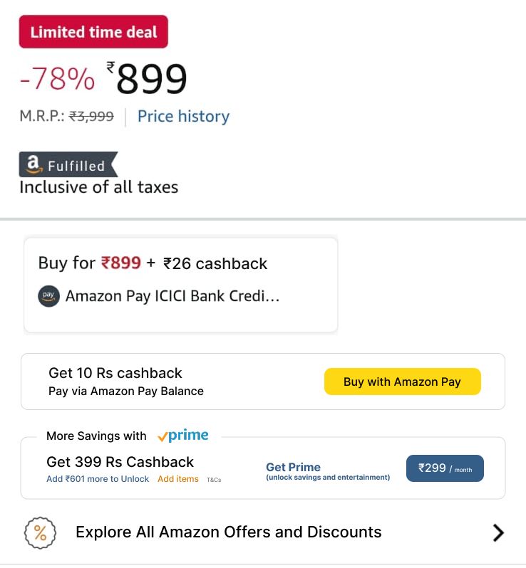
Fig 2: Updated Experience. Displying the relevant cashback offers to users and Promoting Amazon Pay and Prime membership by displaying monthly price as it is low compared to the cashback
Before vs After Comparison
| Aspect | Current (Before) | Proposed (After) |
|---|---|---|
| Offers Shown | All offers in Amazon database | Rearranged applicable offers product + user |
| Offer Count | "2 cashback offers" (includes non-applicable) | "1 cashback offer available" (honest count) |
| Sorting | By offer value (₹399 first, ₹10 second) | By applicability (₹10 first, ₹399/Prime offers later) |
| Messaging | "Get ₹10 cashback when you shop for Rs. 500..." | "You'll get ₹10 cashback with Amazon Pay Balance" |
| Visual Hierarchy | All offers look equally important | Applicable offers highlighted, All platform Offers collapsed |
| User Time | 45-60 seconds reading all offers | 10-15 seconds seeing applicable offer instantly |
Success Metrics (KPIs)
| Metric | Current Baseline (Assumed) | Target After Change | How to Measure |
|---|---|---|---|
| Offer Click-Through Rate | 12-15% | 20-25% | % of users who click "See all offers" on product page |
| Offer Redemption Rate | 3-5% | 10-15% | % of users who view offers and actually use one at checkout |
| Time Spent on Offers Page | 45-60 seconds | 15-20 seconds | Average session time from click to return to product page |
| User Satisfaction (Offers Section) | 2.8/5 stars | 4.2/5 stars | Post-purchase survey: "How helpful were the offers shown?" |
| Support Tickets (Offer-related) | Estimated 50K/month | Under 20K/month | Tickets mentioning "cashback not received", "offer not working" |
Business Impact Metrics
| Impact Area | Expected Change |
|---|---|
| Conversion Rate | +2-3% improvement from reduced friction and clearer value proposition |
| Amazon Pay Adoption | +15-20% increase as payment-specific offers become more visible |
| Prime Subscriptions | Potential uplift from clearer Prime-exclusive offer messaging (when implemented correctly) |
| Customer Trust Score | Improvement in NPS related to "honest pricing" and "clear communication" |
Risks & Mitigation
| Risk | Likelihood | Mitigation Strategy |
|---|---|---|
| Reduced visibility of high-value (upsell) coupons | Medium | If we push the ₹399 offer to the bottom, fewer people might see it. Mitigation: Use a "Card" visual for these offers to draw attention to the upsell potential. |
| Latency in fetching offers | Low | Calculating eligibility for every SKU in real-time might add ms to load time. Mitigation: Compute this asynchronously or cache common price-bracket results. |
Conclusion
The current "One Size Fits All" approach to Amazon's offer section creates a paradox. In trying to show all value, we show no immediate value to the user. For a product priced at ₹899, showing a ₹1500 threshold offer that is also locked behind Prime is a UX anti-pattern. It breeds distrust and increases cognitive load.
By implementing Context-Aware Sorting, we respect the user's current intent. We validate their purchase choice by showing applicable offers first. Simultaneously, we transform the "ineligible" offers into a clearer, gamified upsell mechanism. This small logic change drives trust, speed, and potentially higher basket sizes.
Interested in B2C Product Strategy?
I'd love to solve your problems on optimizing E-Commerce flows for users.
Let's Connect